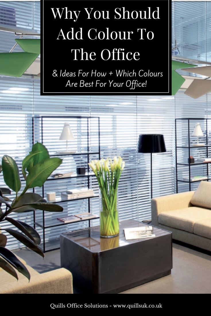
Colour In Office Design – Why It’s Important & How To Use It
Your office design is just as important as the people that are sitting in it – and it’s especially important to those people. In recent years, office design has taken a more people-driven approach and there is now a large emphasis on how your workspace makes your employees feel. One of the best ways to achieve this? Use of colour in office design.
The psychological effects of colour have been studied and stood by for years; the results are rather clear: colours directly affect our psychology. They have the ability to affect moods and create atmosphere – colours can even be used to convey meaning.
According to multisensory design, everything around us is a stimuli – so make sure that your office is stimulating your employees in the right way.
Why You Should Utilise Colour In Office Design
There are a lot of reasons that you should utilise colour in your office design, but here are a few of our favourites.
- Colour can affect your employees’ moods. A University of Texas study discovered that bland grey, beige and white offices caused feelings of sadness and depression in employees – especially in women. Men experienced the same effects, but more notably in purple and orange offices.
- Colour can affect performance. A study found that use of the colour red before an exam actually hindered test performance. In one of six experiments conducted in the study, 71 students were given a participation number in the colour of red, green or black. Students with the red number scored more than 20% lower than those with green and black numbers.
- “Colours impact factors such as productivity, creativity, and communication.”
As you can see, with so many benefits to correctly optimising your office’s colour scheme, there’s no reason not to.
Commonly Used Colours And Their Meanings
Note: A lot of our associations with colour are personal and relevant to your culture. An example of this being the colour white. In Western culture, white can be used to represent purity (for example, “wearing the white hat”, weddings, angels), but in many Eastern countries white is associated with mourning.

- Blue – commonly used in workplaces as it can benefit productivity; a calm and focused colour.
- Yellow – commonly used in creative industry work-spaces as it can increase creativity; an optimistic colour. Warning: yellow can be too stimulating in excess.
- Red – commonly used in workplaces where physical activity is required; a passionate colour that can increase brain wave activity, boost heart rate and blood flow and incite activity. Warning: as with yellow, avoid excess. Too much red can incite feelings of anger and hostility.
- Green – commonly used in offices with long hours where innovation is required; a harmonious and calming colour. Green can reduce eye-strain and anxiety.
- White – studies have shown white to be one of the worst colours to paint an office; a clinical and isolating colour, white can hinder productivity.
Warm Colours vs. Cool Colours
When deciding what colours to use in your office design, another factor to consider is whether you’re going to go with warm or cool tones.

If you’re unsure of what is considered a cool or a warm colour, this colour wheel is a useful guide.
Warm colours
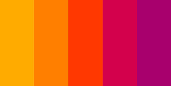
Warm colours are colours made with orange, red, yellow and combinations of these with other colours; they’re associated with heat and sunlight. Warm colours cause stimulation – they’re attributed with increased emotional response and passion.
However, due to warm colours being emotionally stimulating, they can also cause volatile emotions such as anger.
A prime example of this would be the colour red; red is an emotional colour. It can represent love and romance, but also anger.
Cool colours
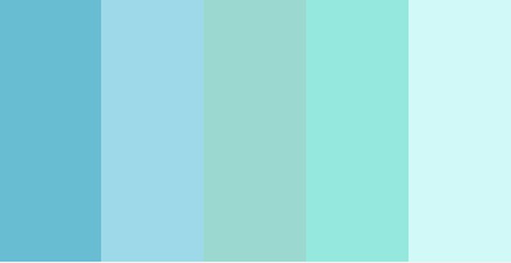
On the other hand, cool colours are much more calming. Made of blues, greens and purples, the connotations of cool colours are things like water and ice. Cool colours make you feel calm, relaxed and refreshed.
However, while cool colours may be calming, they can also result in feelings of sadness and isolation or detachment.
An good example of the use of cool colours is the popularity of the colour blue. A lot of offices utilise blue to work in and a lot of corporate businesses have blue branding. This shows professionalism – but no emotion.
How To Introduce Colours To Your Office
Now that you want to utilise colours in office design, how do you go about it? Firstly, there are two things to consider.
Accent colour or main feature?
Painting your office walls a new colour or installing a bright carpet is going to be a dramatic difference – and one that might not be beneficial. Depending on the colour and the atmosphere you’re trying to create in your office, you may want to add an accent colour instead of it being the main focus.
Accent Colours
Accent colours are a way of adding colours in office design in a more subtle way.
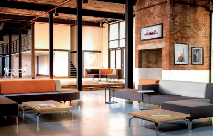
For example, this office breakout area has added orange in as an accent colour; it’s not too overpowering, but it still allows the colour to be clearly visible. (This breakout area furniture is available at Quills Interios service and is called “Skyline” email: interiors@quillsuk.co.uk for further details.)
When dealing with colours that are emotive, featuring them as accents is preferable. As previously mentioned, especially with warmer colours, you can have too much of a good thing.
Reminder example: yellow can be good for creativity, but too much of it can over-stimulate and rile tempers.
Main Colours
Adding colours in office design as a main feature can make a bold statement and really draw the eye.


Fabricks walls are a great way to achieve this bold statement – and they also have the additional benefit of helping your office’s acoustics. Available in a range of colours to suit any business and a brilliant way to separate your office space, Fabricks are a great way to inject some colour into your office!
If you’re interested in Fabricks, don’t hesitate to send through an enquiry – we’d be happy to help.
A blend of the two . . .
While on the topic of accent colours or main features, we thought we’d share one of our favourite examples – one that has the best of both worlds.
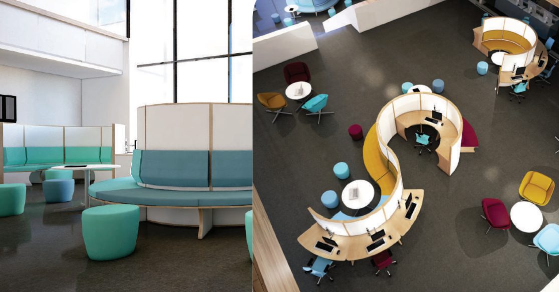
Our O’Zone range is a perfect solution. In areas where people need to work, accent colours can be utilised in the form of colour-co-ordinated seating in a minimal (and not distracting) space. However, in breakout zones, you can feel the full effects of the colour.
Not only do you reap all the benefits of utilising colours in office design – while avoiding all the drawbacks – our O’Zone range is also an incredibly efficient and fun use of space. Plus, it offers both privacy and collaborative working opportunities, both of which are essential for a productive working environment.
We hope we convinced you to try adding colour into your office design – and showed you some inspiring ways of how to do this. If you are interested in redesigning your office, but you don’t have the time or experience to do it yourself, feel free to contact us or check out our Quills Interiors website.
Call: 0845 078 0324 Email: sales@quillsuk.co.uk Live chat: www.quillsuk.co.uk